
A personal finance app designed to educate financially illiterate young adults.
What is my idea?
My Role
Managing finances can be overwhelming, especially without a strong understanding. Being financially illiterate can result in making poor financial decisions that can be costly for years to come. Having easily accessible resources can help a person make smart decisions and improve their quality of life.
UX Research, UX Design, UI Design
Timeline
Oct 2021- April 2022


Problem Statement
The majority of young Americans are financially illiterate. Studies show only 16% of millennials understand basic financial topics. Americans aged 18-29 owe over $1T in debt as of 2019, and with Covid that number is expected to go even higher.
Hypothesis
A mobile app that analyzes users' finances, provide customized tips and advice, and uses personal finance as educational materials will help young adults gain interest and knowledge in financial subjects, enabling them to make smart financial decisions.


Secondary Research
Secondary Data
Young adults in America today have poor financial literacy. The research shows:
83.6%
83.6% of U.S. students
are NOT required to take a personal finance class in school.
76% of Millennials lack basic financial knowledge.
70% of Millennials are stressed and anxious about saving for retirement.
Four out of five adults say they were never given the opportunity to learn about personal finance."
Competitive Analysis
Intuit Mint
YNAB
Simplifi by quiken
Strength
- No monthly fee
- Connects bank accounts and credit card accounts
- Manual account entries
- Customizable subcategories
- Easy to set up
- Regular credit score updates
- Designed to help get out of debt
- Offers educational tools and free workshops
- Provides personal customer support
- Allows budgeting for future months
- Includes in-depth features
- Fairly easy to use
- Respected company in the finance industry
- Low monthly fee ($3.99)
- Customizable main and subcategories
- Includes a shopping refund tracker
- Monthly fee is high
- Budget system is complicated to learn
- Manual accounts are supported
- Only available to U.S. residents
Weakness
- Can only set a budget for the current month
- Focuses more on tracking money than on helping save money
- Main category not customizable
Indirect Competitors
The three biggest companies in this field provide services to help individuals manage and track their finances.
Most of these services automatically track and analyze users' finances for their convenience.
Through this research, I have found that there are no direct competitors in this field. Existing services handle tasks for users without focusing on simultaneous education. This presents an opportunity to address a significant gap where young adults need the most help.

Personas
I created personas based on my demographic research, identifying two distinct user types.

Informational Architecture

To ensure flawless and easy navigation for financially literate users, I have revised the Information Architecture several times, and this is the final structure.
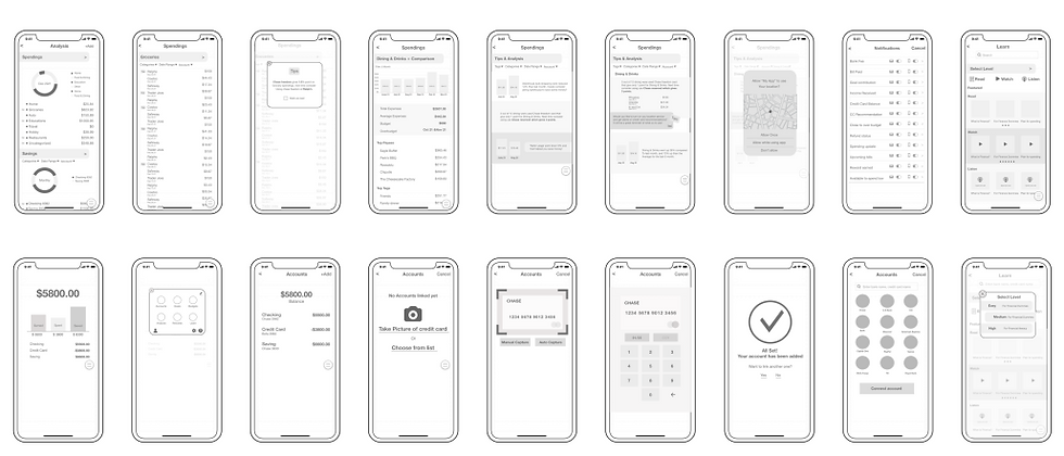
User Stories, User Flows, Sketches, Wireframes
Interesting Finding
People overestimate their financial literacy regardless of their social status.
One survey question asked participants to rate their perceived level of financial literacy.
Comparing their responses to the preset data points in the quiz revealed that many participants are not as financially literate as they believe.
Interesting Finding
- Participants understand the importance of financial literacy.
- Finance is perceived as a challenging subject.
- They believe they manage their personal finances well but remain open to advice.
- They lose interest if financial information is not relatable.
Key Findings
86% believed they are
financially literate
80% chose incorrect answers
80%
20%
86%
14%
Primary Research
Surveys and Interviews
Financially Literate
Incorrect


The main objective of usability testing was to find out how users interact with the features and discover how easy they can navigate the product. A total of 5 people have tested via zoom with shared screens.

Key Issue
- Dashboard was not reading clearly.
- Excessive information about sub-features on the dashboard, leading to confusion.
- Some UI elements were causing confusion, for example, some had gradients, some were white etc.
- Revised colors and made the appearance of cards cohesive.
- Rearranged and minimized elements related to sub features.

Key Issue
- The page shows too many previews, occupying excessive space and requiring scrolling to view more featured items.
- The "level" selection feature was not prominent.
Solution
- Revised the layout by placing featured articles/videos/podcasts at the top of the page and highlighting them in bold to establish a clear hierarchy.
- Enhanced the prominence and cohesion of the level selection by converting it into a dropdown menu, consistent with other pages.
Key Issue
- The page shows too many previews, occupying excessive space and requiring scrolling to view more featured items.
- The "level" selection feature was not prominent.
Solution
- Designed a dashboard for the "Reports" page to display all in one page.
- Renamed the title from "Analysis" to "Reports" for clarity.
- Enlarged the icons in the bottom menu by removing the enclosed shape around them.

1.
2.
Usability Testing
Solution

Final Pages


Takeaways
Design Process
- Know the user, and be in their shoes.
- Allow more time to know the user and their thoughts, without any assumptions.
- Repeat the step of usability testing and iterations as much as needed.
This Industry
- There are great products available and young adults are already using them
- No product offers education material, especially using user’s finance
- There is a white space for educating young adults to become financially savvy.
Next Steps for “My Budget”
1.
Offer more advanced features as well as more basic features for broader users
2.
Continue to guide them using their personal finances as an educational resource to keep them interested.
3.
Offer more features
to attract young adults with gamification or collaborations with products that users are big fans of.
Wireframes


GALLERYPAL
Problem Statement
My Idea
Solution
How to improve the experience of viewing art in a museum.
The most memorable museum experience I had was when I had a tour guide. The guide shared her knowledge of the art pieces with us and told us fun and exciting stories that I would never have known just by looking at the pieces. This truly immersed me in the world the artists had created.
Providing a pre-recorded video of a tour guide explaining detailed and exciting stories about the art pieces while viewing them on site will have a significant impact and create a memorable experience.
My Role
Design Method
Timeline
UX UI Design
Google Venture Design Sprint
5 Days
DAY 1 - MAP
Lightning Demo (Provided from GalleryPal)
-
Visitor googles for art information but they are too long and too in depth
-
Need context behind
-
Sometimes guide/tour is helpful
-
Need more information on techniques and processes.
-
Need to promote nonfamous pieces as well
-
Want to hear artists explaining art if possible
Visitor’s Thoughts
-
Typically they don’t come with research
-
Help people set up the context, and help to get the intention of the artist.
-
The goal is to make the guests go objectively and come out having their opinion about it
Curator's Thought
Key Findings from Research
Providing a greater variety of options for accessing information about the art would be helpful.
Tours are helpful, so providing information through audio or video will also be beneficial.
Providing information about the artist's intentions and the techniques used would be helpful
Featuring previously unfeatured art pieces somewhere would be helpful.
Providing a video of the artist explaining will be helpful.
Personas (Provided by GalleryPal)
Behavior
Since moving to New York a year ago, Angela has tried to take advantage of all the world class art and museums in the city. She goes to the more popular museums every couple of months - usually by herself. Angela doesn't really look for specific exhibitions or artists - she just goes and browses whatever work is being showcased.
Frustrations
Angela enjoys her visits but feels like if she knew a little more, she would have a better experience. Angela has tried to read some books and articles on the art she's seen but loses interest due to how long and in-depth they are.
Goals
Angela wants to get quick information while looking at the art that will give her a better appreciation for it, and make her feel like she is making the most out of her visit.

HMW questions
How might we enhance guest engagement with the art pieces
How might we provide content that guests can easily customize
How might we inspire those who are not familiar with the art pieces
How might we design the app to be simple and easy-to-use for users of all ages
How might we satisfy all types of guests, whether they prefer in-depth or summarized content
End to end user experience
To better understand the user's behaviors, I have created a map of end-to-end user experience.
1. Enter the gallery, and open the app to get started.
2. Glance through the app to see what features it offers.
3-1. Start the tour from the closest room to the entrance.
3-2. Find the location of the art guest wants to view.
4. Scan the QR code or input the number of the artwork on the audio player.
5-1. Find more artworks related to this art piece.
5-2. Select options for additional content.
6. Move on to the next artwork and scan the QR code or input the artwork number.
7. Find information on the techniques used by the artist.
8. Leave the museum with a great and pleasant experience.


Key Findings
- The museum apps do not provide pre-recorded tour guides.
- The information they provide regarding the art pieces is often lengthy and in-depth.
-
The audio tour showcased the art and description on the screen.
-
Provides transcript of audio and credits
-
App provided four different languages.
-
Few art pieces had a “related tour”
-
Has number keyboard for art lookup
Art Institue Chicago


-
Best known for identifying art pieces when scanned with a camera
-
Provides some additional information on the art
-
For more in-depth information, it connects to the museum website or Wikipedia
Smartify


DAY 2 - RESEARCH
Lightning Demo (Provided from GalleryPal)
End to end user experience
I chose to use Crazy 8s for designing both the starting page and a page where users can choose different options for more information.

From these, I have selected the simplest and easiest design to accommodate various users.
I sketched screens before and after to visualize how users will interact.
3
4
While the guide discusses the details, there will be an option to zoom in and view close-up shots on the screen.
There will be options to learn more about the art pieces, including an in-depth option and a brief summary option.
4
There will be multiple options for video-guided tours to choose from.
Once the video tour is selected, the tour guide will explain the art piece with enthusiasm and liveliness.
1
2

Download app - welcome page - watch how it works - select where to start the tour - watch the tour - select “learn more” - select options on what you want to do next - take the rest of the tour - leave the museum all inspired and enjoyed.
Storyboard
DAY 3 - DECIDE
On Day 3, I created a storyboard using my solution sketch. First, users download the app and encounter the welcome onboarding page. Then, they are presented with three options: video tour, audio tour, and explore more.

DAY 4 - Prototype
As for the layout design, I aimed to keep it simple and clean, especially since some pages can contain a substantial amount of information.


1


3


2
4


Conclusion
Currently, most people prefer audio tours. My idea is to upgrade the audio tour to a
pre-recorded video tour to replicate the experience of a real-person tour guide. This enhancement will allow guests to engage more with the art pieces, learn in a fun way, and ultimately bring more excitement to their gallery visit.
Day 5 - Testing
I interviewed people who enjoy visiting museums, and overall, they liked the product. They said they wanted to see if there are other museums or apps that offer similar services.
Most interviewees liked the idea of a lively person's explanation and mentioned that it sounds more engaging than a quiet, monotone audio player.
They appreciated the ability to listen only to what they wanted to hear.
hey liked the fact that they didn't need to pay extra for a tour guide.
They liked the fact that they didn't need to pay extra for a tour guide.